Maya Lin: Artist’s Statement
Smith College—Neilson Library
Published May 6, 2021
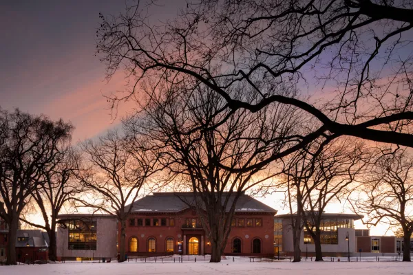
In designing the Neilson Library, I envisioned a dance between old and new. The design would reconnect the library to the heart of the campus, and to the layout envisaged by Frederick Olmsted.
By preserving the exterior walls and original foundation footprint of the original Neilson, the new library retains the memory of the original structure and takes full advantage of building on the foundation of the library. But the interior speaks to the needs of students, faculty and scholars today, with more room for collaborating and socializing. There’s a café, plenty of room for digital tools, and even studios to record a podcast—but it’s still a home for books. I still believe in the beauty of ink and paper books.
When one enters the library it’s through the historic, eastern entry. At this entry point the east facing windows retain the historic divided light windows, while the western windows facing the Burton Lawn are stripped of the mullions to reflect the transitioning of the building from historic to present day. The curved, organically shaped jewel boxes are a gentle contrast to the original, orthogonal design, and a reflection of my aesthetic—that explores a more hand drawn organic form. They are like bookends that help create a dialogue between the old and new construction.
There is an intentional delicacy to the jewel box additions. I also chose the curved design to invite seating and reading. The human body cannot sit in a corner, but you can inhabit the curves. The curved design enables students, faculty and visitors to surround the Special Collections—importantly, one of the largest collections of women’s history of any college in the world. The two jewel box additions are a measured contrast. In the south jewel box, which houses the Special Collections, visitors surround the books—set apart in an interior glass encased volume that appears to travel through all floors of the space. This articulation of the Special Collections also allows for the isolation of the most energy-intensive storage needs of the Special Collections, helping to make this library one of the most energy efficient libraries to be built in the country.
Connection to, and attention to, the exterior spaces surrounding the library was a very important consideration. With Edwina von Gal and Ryan Associates, I was able to create main entry landscapes that provide seating and entrance ways at all four entry points to the library and also create a shared space to the adjacent buildings. With its smaller footprint, the new Neilson frees up the historic Olmsted campus, while inviting people to sit in an outdoor amphitheater or the grassy lawns in front of each jewel box. Once inside, you are always connected to the campus: from the jewel boxes, which visually link to the campus surroundings, to the sunken courtyard with views to the outside, to the rooftop vista that connects one to the surrounding mountains on a clear day, and of course the oculus sun scoop, which invites natural light.
All projects are personal in their own way, but Neilson was especially so. I would not exist were it not for the scholarship to Smith College that enabled my mother to escape Communist China in a fishing boat with her acceptance letter sewn into her shirt. Smith College is so much a part of her story—and, of course, mine as well.
Photograph by Nic Lehoux
